8th Apr 2022 Return to Monkey Island
I'LL SEND YOU SCREAMING TO ANOTHER DIMENSION, ONE OF INFINITE PAIN!
I’m a rather stable guy. When I experience big disappointments, I usually get over them rather quickly… and then again, when I accomplish something big, I easily downplay the achievement. I guess it’s not that easy to rock my world.
But on Monday, April 4th 2022 my old idol Ron Gilbert managed to do just that. He revealed that for the last two years, he’s been working on a sequel to the infamous Monkey Island 2: LeChuck’s Revenge! The game is soon finished and will be out later in 2022. WTF!
For me personally, this is especially emotional because throughout my life, Monkey Island 1 & 2 are the video games (and pieces of art in general) that have had the most significant influence to me as a human being. They’ve been with me every step of the way. I first played them in 1991 or 1992 at age 8 without any understanding of the English language (I believe my dad told me what the verbs meant and that’s all). When I got on my first date in 1998, we spent the evening playing SoMI together. And in 2007, when I madly fell in love for the first time, some the best moments of that relationship were spent playing SoMI together. And without Monkey Island, I never would’ve begun developing Sixtus Flaming, that’s for sure. I can’t stress enough the monumental importance these games have to me. Nothing else can ever come close.
I’m not the only one to whom this was an incredible announcement, though: after 30 years, the man who’s always been best known from Monkey Islands 1 & 2 returns for the incredibly long anticipated 3rd chapter. Do we finally get to find out the SECRET of Monkey Island? Do we get to find out what happened in/after the end of LeChuck’s Revenge? Well, I believe these questions have stayed with us for all these decades solely because they WERE left unanswered, and that was BRILLIANT. If Ron is going to answer them now (I don’t think he should), he’d better have even bigger questions in store for us. I very much believe that it’s the questions – the mystery – that drives us. That’s what made Monkey Island’s legacy so wonderful. That’s why the 3rd game should end with the same amount of ambiguity.
PIXEL ART VS. HI-RES?
The teaser trailer that was released with the announcement showed a glimpse of the visual style of the upcoming game. Some loved it, some liked it, and then there were those of us who think that Monkey Island is, in it’s core, a pixelart world – Ron Gilbert himself has said so in his famous 2013 blog post.
As the teaser trailer makes clear, however (and he soon updated that blog post accordingly), those words don’t matter anymore because Gilbert has changed his mind. Either he was pressured into that by Disney or simply because it’s been 9 years and circumstances/people change.
I’ve spent some time this week arguing that the retro visual style is a crucial part of the true Monkey Island spirit. Well, it is, but I have now come to a realization that the idea of making the new game a hi-res one in itself is NOT the actual issue here. I don’t dislike Curse’s visual style (as a Monkey Island game) because it has better resolution than Monkey 2. I dislike it because the approach is GOOFY and CARTOONISH.
“Well why is that such a big deal?” you might ask. “Guybrush is a funny chap and the games have so much humour in them they can be called comedies. Cartoonish style is a good match to that.”

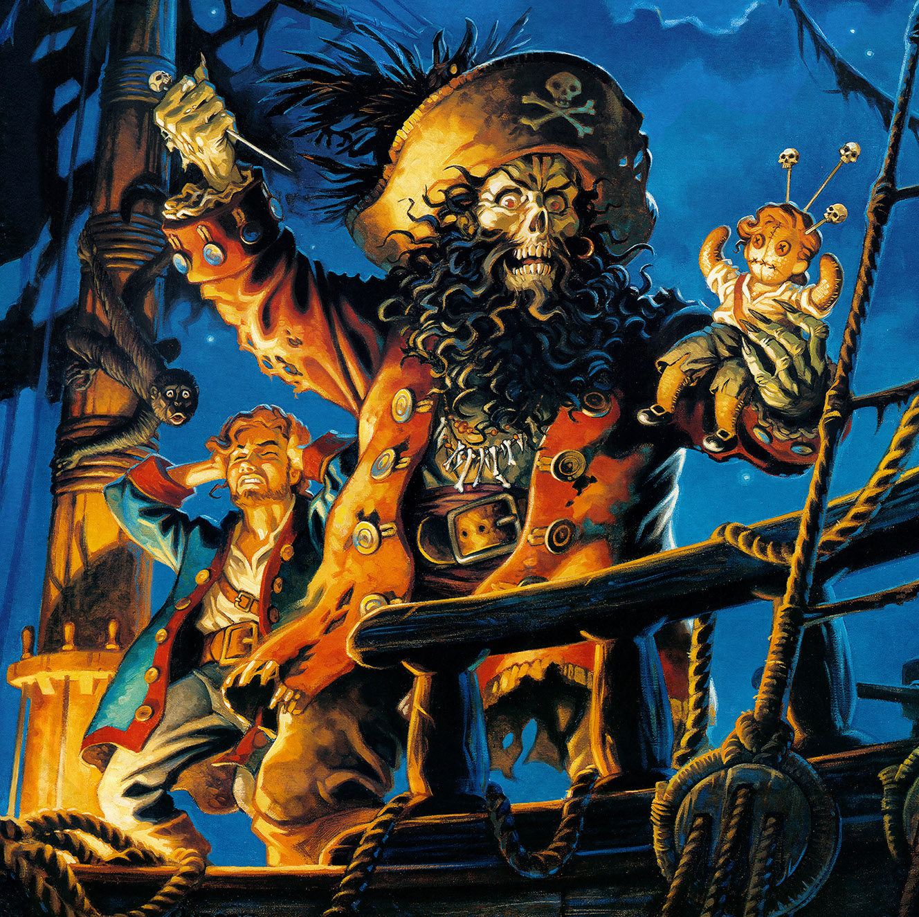
Crop from the box cover art of Monkey Island 2: LeChuck’s Revenge
© LucasFilm Games, Disney
Monkey 1 & 2 certainly have those qualities: they are very funny games! But at least for me personally, that’s not at all the full extent of what these games have going for them. Especially Monkey 2! If you look at the magnificent cover art of LeChuck’s Revenge and imagine you’d now see it for the first time, I’d be surprised if your reaction would be “ah, we’re in for some goofy fun.” That cover is downright scary. And at least to a certain 8-year-old boy, it was definitely scary.

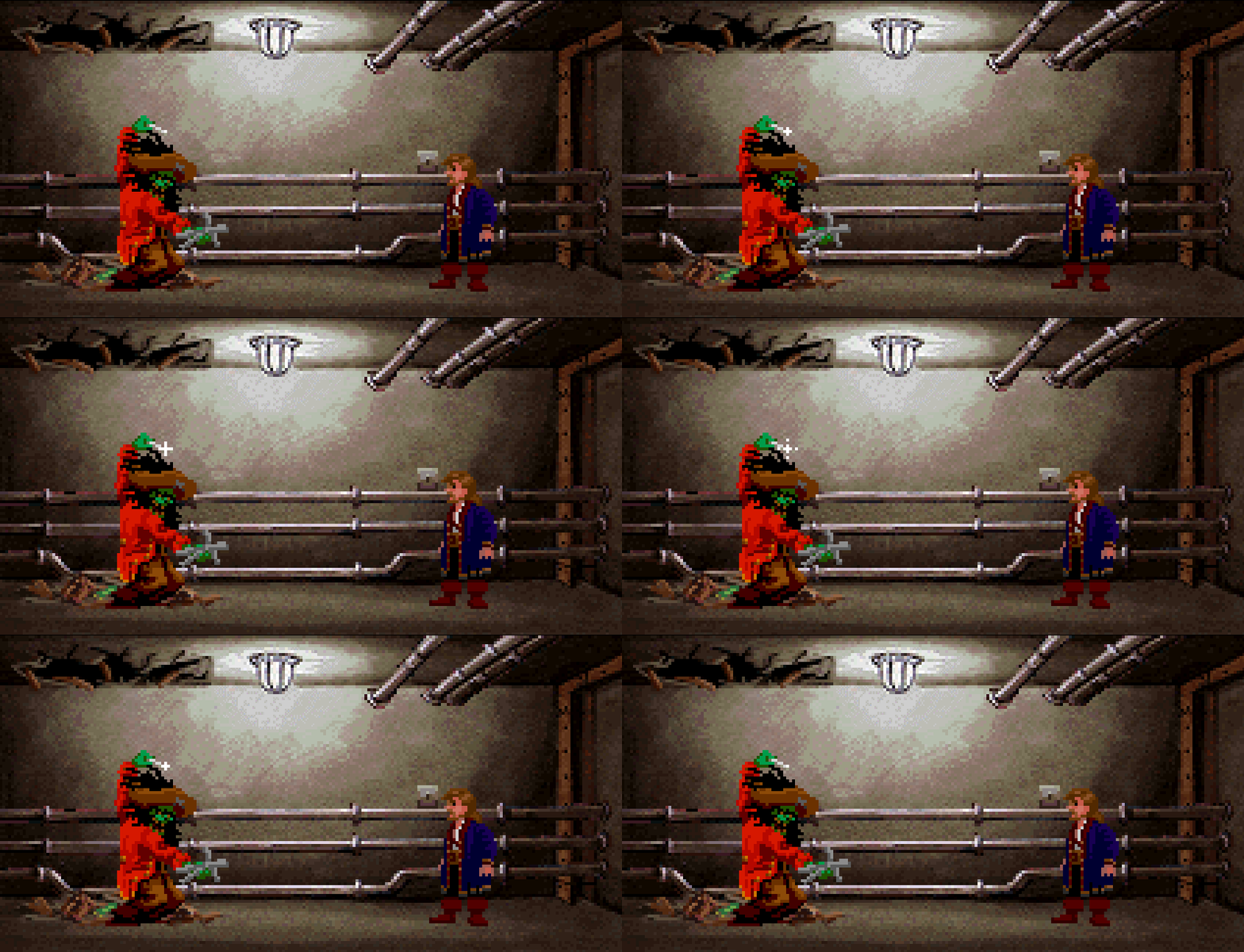
Crop from the game Monkey Island 2: LeChuck’s Revenge
© LucasFilm Games, Disney
“WHAT’S WITH THAT BIG, SHARP, DEADLY-LOOKING PIN?”
When I entered that tunnel at the end of Monkey 2 for the first time (again, I was 8 years old) and started my escape, my heart was pounding because it was clear that LeChuck could reappear any second! I kept click-click-clicking things hoping that Guybrush would move faster to prevent another encounter. I was about to have a heart attack whenever the scary music would announce the zombie pirate’s arrival. To this day I remember the visceral panic. As I looked at LeChuck’s pixelart sprite graphic, in my mind’s eye I was looking at the realistic monster I had seen in the box cover art.
I was young and those things stayed in my mind: I started having actual nightmares because of that part of Monkey 2. I even asked my parents to hide the diskettes of the game so that I couldn’t play it anymore! But I always found them anyway and resumed playing…
I haven’t really discussed this with anyone before so I don’t know if anyone else has anywhere near the same experience of these darker aspects of Monkey 2. I don’t know if others have found it as scary.
To me, this definitely influenced how I see the games now: while I love them both, Monkey 2 is my favourite because it’s a richer experience that offers a wider variety of emotions. And when I think of the game, it’s easy to draw comparisons to a phenomenal tv-series from the same era, Twin Peaks (1990-91), which also had the ability to jump from scary to funny and back effortlessly. Actually, if you look at the ending of season 2 of Twin Peaks and compare that to the ending of Monkey 2, well… there definitely are similarities! Both are legendary. Actually, I wouldn’t be surprised if Ron Gilbert was influenced by the tv show to some extent. Gilbert also recently tweeted that he finished watching Twin Peaks: The Return (2017) and loved it.
REALISTIC VS. CARTOONISH

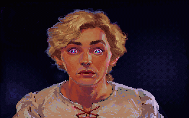
A close-up of Guybrush in the Secret of Monkey Island
© LucasFilm Games, Disney
So, to come back to the pixelart thing, I think my biggest problem with The Curse of Monkey Island and the ones that came after is simple: the better resolution is not the problem there, it’s the fact that the characters aren’t realistic. I think I would have absolutely no problem with the new game having hi-res visuals had the characters been created in a realistic visual style, using that box cover art for LeChuck’s Revenge as a reference. And if you look at any of the SoMI’s in-game closeup screens (especially the VGA version), they are extremely realistic as well. Actually in-game, SoMI is the more realistic one of the two.
On the other hand, having a realistic visual style in the new game would probably be a problem for other people. It would likely be a turnoff for anyone waiting for the visual style Curse etc. had.
And THAT is precisely why the pixelart approach is so wonderful: with pixelart, there is ambiguity. It doesn’t matter if you prefer a realistic look or a more cartoonish look. It’s up to you to experience the art either way! Those big, juicy pixels leave the characters’ details ambiguous and therefore give you room to dream so you can decide for yourself.
TO SUM IT UP
We now know that the team decided to go with the more-or-less cartoonish high-res style. It’s a shame, but I’ll be doing my best to ignore this. In any case, I’m definitely going to be playing the hell out of Return to Monkey Island when it arrives. I have a firm belief that even in its worst possible form it’s going to be a dream come true.
I want to send my heartfelt thanks to the whole RtMI team for realizing this dream I’ve had for 30 games that there would be another one. I’m sure it’s gonna be fantastic! And my guess is we’ll see an actual trailer within the next month.
-luuk

Hank Plank
Posted at 15:59h, 08 AprilGreat post. Reading this and I have the same opinion basically.
My sister who was I guess also around 8 (who I played the game with) was also dead scared of the last tunnelscene where LeChuck popped up. It was almost like jump-scares to her. Yes, it was creepy. The whole last part was incredible. The two first games had a wonderful mix of realism and humor, and especially the second game can get kind of dark at times. Twin Peaks is a great comparison! So I would have loved to see Return To Monkey Island also being a bit scary (and mysterious/ominous), as that has been dropped a little in the later games.
You are right. With Curse the games took a more cartoonish directions, and that was a common complaint at the time in the Monkey Island forums when it came out I recall.. Guybrush “looked a pencil”, and LeChuck wasn’t scary anymore. Thats what most people said. Later on I’ve come to realize how loved CMI really is though. I’ve met people thinking I’ve had something in common when I hear they love love love Monkey Island, only to find out they’ve only played Curse. That game alone also often ends up on many point&click fans top lists. Its often those who plays Curse first though.
I agree the graphics might work against the possibility of it being scary or realistic the same way, as the teaser does have a bit more cartoonish style. I would have loved the graphics to be more like Thimbleweed Park. In my fantasies I pray there’s a function like the special editions to switch between new and old graphics, like the special editions of MI1 and MI2. I’m afraid of hoping that because its probably not going to be.
I’ll take it though. It being Ron Gilbert and Dave Grossman I’m sure there’s going to be plenty to love with the game either way. I also waited 30 years for this game. I’d play Ron Gilberts MI3a with stickfigures graphic or even just as a text adventure, if nothing else.
Davide
Posted at 12:52h, 25 AprilVery interesting observations.
When I was a kid, I too got scared when LeChuck tortured Guybrush in Dinky’s dungeons.
And I also intimately associate the world of Monkey Island with 320×200 resolution, so when the first screenshots of Return to Monkey Island appeared, I was struck by the fact that Ron had given up on making the game in that mode.
However … the concepts of resolution, style, and emotional tone need to be well distinguished and disambigued. Because this distinction is the “Solomon’s key” to better appreciate Ron’s new work.
Beyond the technical limitations of the time, which helped to shape the look we now define as “pixel art”, Monkey 1 still didn’t have a strong artistic direction.
There were “realistic” images (Guybrush close-ups) mixed with some cartoon gags (Guybrush with the cannon, the final fight with LeChuck, the “banana picker” …).
Certainly “realism” prevails but a subtle cartoonization is already evident.
Let’s take Monkey 2. Here the cartoon aspect is much stronger. If we look at characters like Phatt’s governor, the guard, Largo, but also some Guybrush animations (when he drinks the grog from Rum Rogers Jr. – when he meets the “fake” LeChuck – when he picks up the dog or the monkey .. .) we can see how the graphs were already pushing for a more stylized and less realistic approach.
Important note: the close-ups of the protagonists are completely missing. Why?
More: if you look at some images taken from the Monkey 1-2 source code or some unused sketches by Peter Chan … you notice that a DRASTIC change of style – more stylized, deformed and very similar to the one then used in DOTT – was already present.
… as something underground, hidden, an unconscious push towards a stylistic change that was just waiting for the right moment to emerge.
The graphic style of the Lucas 89-92 adventures in fact – let’s not count The Dig whose work had begun well before 95 – would have been abandoned in 93 in favor of larger sprites, more stylized backgrounds and a general aspect that wanted to tend to the cartoon interactive.
It was not just an internal issue at Lucas, but it was a trend of those years: the Sierra had already experimented in this sense with Leisure Suit Larry 5 (1991) and Willy Beamish (1991).
What I mean is that … if Monkey 3 had really been designed in 93-94-95 it would almost certainly have had a look closer to that of DOTT (and paradoxically more like the current one, resolution excluded!) Than that by Monkey 2.
It wouldn’t have been “realistic” in any way, at least not like Purcell’s cover art.
We also look at “Indiana Jones and Iron Phoenix”: although they are only sketches, the ones that remain clearly indicate that the graphics were developing in a stylized and cartoonish direction.
What many are now misunderstanding is that they tie this new graphic style of Return to something modern, when it is absolutely retro. Not only because he is directly connected with DOTT, but also because his inspirations come from much earlier: just think of the artist Maurice Noble and his production of the 50s, as well as some Disney cartoons of the time, but also German expressionism and to its distorted perspectives (Caligari, Metropolis …).
Ron and Dave’s was not a choice to please a “young audience” (they would have been much more successful with realistic 3d graphics, probably …) but a philological attempt – conscious or not, it doesn’t matter – to connect this new work on its roots, the 90s.
As for the emotional tone, I totally agree with you: the first two Monkeys were both funny and scary, subtly creepy, as was Thimbelweed Park.
I am sure that Ron is perfectly clear on this point, also because it is part of his poetics, and he knows that this is a characteristic that more than cartoon graphics (there are very disturbing cartoons!) Is due to the atmosphere, the music, the expressions of the characters, dialogues, narration.
If you look on the Rex Crowle page, among the most childish and colorful, there is a portrait of a knight in the rain.
Here … although it is “that style”, in that portrait there is despair, sadness, fear. It is a very flexible style, which can elegantly go from being “cartoon” to being dramatic and, why not, scary.
We haven’t seen anything yet, but I really think we’re going to like…
… return to Monkey Island.