3rd Nov 2021 Frame rates and animation
DANCE. EVEN IF YOU HAVE NOWHERE TO DO IT BUT YOUR OWN LIVING ROOM.
As a filmmaker, I have always heavily disliked high frame rate cinematography.
The very first experiments with this medium and art form with the late 19th century cinematographs had rather low frame rates. With the silent movie era it went up to around 16 FPS, and finally became fixed at 24 FPS (partly because of sound). Even at 24 FPS, we remain far from the top speed the human eye is capable of detecting, but that definitely doesn’t mean one should aim to go higher. 24 FPS is just enough to give an audience the illusion of lifelike movement… albeit slightly dreamy. 24 FPS hit the perfect balance.
Some blockbuster filmmakers like Peter Jackson and later also Ang Lee have been fighting this standard with their gigantic productions by going 48 FPS or even 120 FPS, as if 3D (also a failure) wasn’t enough. I’ve never understood the reasons behind these ideas.
In order to give you a detailed scientific explanation as to why I heavily dislike high frame rates, I’m gonna go with “it just looks bad”. Namely, too smooth. A bit like soap opera or reality TV and even more like a sports match. In short, 24 FPS is what a film should* look like.
“Well, I’m glad you got that our of your system. But what does all of this have to do with the creation of a retro point & click adventure game?”
Well, when going retro, there’s a crucial discussion that needs to take place. Which rules shall we stick by? For some time already, we haven’t HAD to think about the technical limitations of the golden years, so you have to DECIDE which year’s level you’re going to go with (there are obviously more variants than this, I’ll knowingly overlook some of them):
- 320 x 200, 4 colours: a super-purist CGA approach
- 320 x 200, 16 colours: EGA, from Maniac Mansion to the Secret of Monkey Island
- 320 x 200, 256 colours: VGA, from Monkey Island 2: LeChuck’s Revenge to The Dig
- 640 x 480, 256 colours: VGA, from the Curse of Monkey Island to Escape from Monkey Island
So, you need to ask yourself these questions: Do you like big pixels? What’s the game’s aspect ratio? What about the colour palette?
In the case of Sixtus Flaming in the Far Reaches of the World, we will go with 320 x 180 (in favor of the modern 16:9 aspect ratio) and with unlimited colours. The colours aren’t going to be unlimited when creating the pixelart backgrounds, though (and they’ll be even more restricted for all the sprites) – for each scene, our pixel artists will decide upon a palette and stick by it, but we’re going to add modern effects and such to bring forth a game we would’ve liked to see back when we were kids. So, in conclusion, the approach is rather similar to that of Thimbleweed Park.
“That’s nice, but AGAIN, what does this have to do with the high frame rate cinematography, with which you opened this rambling?”

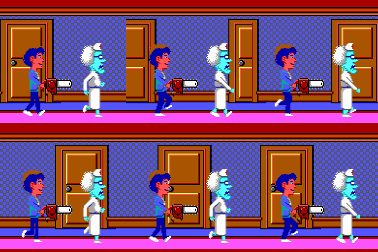
The “Dance” aka walk cycle from Maniac Mansion (3 frames)
© LucasFilm Games, Disney
All right, all right! We now return to the topic of smoothness. Because of file size limitations, the animation with the early LucasArts classics was very simple. It later became more nuanced as technology allowed it.
This key question was missing from the list above: what are we going to do with animation? Especially, how SMOOTH should it be? What is the FRAME RATE we’re going for? With SIXT, we’re going with big pixels, so that kind of calls for an animation style which isn’t super smooth, because the big pixel games of the past usually weren’t very smooth.
I guess it boils down to two things: 1) how much does the team want to restrict itself and 2) can smooth animation in a retro adventure game please the eye (while in film, high frame rate (in my opinion) cannot)?
And the definitive answer to those… I do not know! I’m not sure! Which is why I’m going to ask YOU!
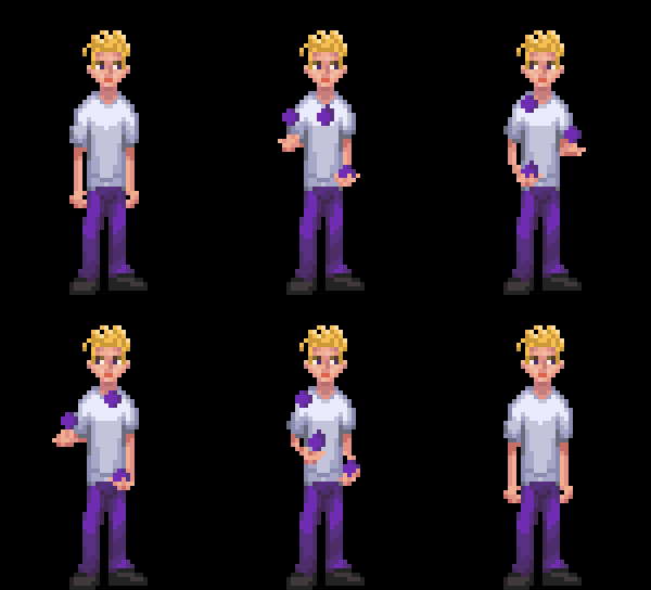
Not all adventure game characters can juggle. Sixtus Flaming can. Which kind of motion do you prefer?

A smooth animation

only 50% of the frames used; shown at a slower speed
-luuk
*) That said, knowing these rules may inspire the best filmmakers to break them in innovative ways which can certainly lead into a place both wonderful and strange… BUT, also, inspire lesser filmmakers to do something we don’t want to see.
DANCE. EVEN IF YOU HAVE NOWHERE TO DO IT BUT YOUR OWN LIVING ROOM.
As a filmmaker, I have always heavily disliked high frame rate cinematography.
The very first experiments with this medium and art form with the late 19th century cinematographs had rather low frame rates. With the silent movie era it went up to around 16 FPS, and finally became fixed at 24 FPS (partly because of sound). Even at 24 FPS, we remain far from the top speed the human eye is capable of detecting, but that definitely doesn’t mean one should aim to go higher. 24 FPS is just enough to give an audience the illusion of lifelike movement… albeit slightly dreamy. 24 FPS hit the perfect balance.
Some blockbuster filmmakers like Peter Jackson and later also Ang Lee have been fighting this standard with their gigantic productions by going 48 FPS or even 120 FPS, as if 3D (also a failure) wasn’t enough. I’ve never understood the reasons behind these ideas.
In order to give you a detailed scientific explanation as to why I heavily dislike high frame rates, I’m gonna go with “it just looks bad”. Namely, too smooth. A bit like soap opera or reality TV and even more like a sports match. In short, 24 FPS is what a film should* look like.
“Well, I’m glad you got that our of your system. But what does all of this have to do with the creation of a retro point & click adventure game?”
Well, when going retro, there’s a crucial discussion that needs to take place. Which rules shall we stick by? For some time already, we haven’t HAD to think about the technical limitations of the golden years, so you have to DECIDE which year’s level you’re going to go with (there are obviously more variants than this, I’ll knowingly overlook some of them):
- 320 x 200, 4 colours: a super-purist CGA approach
- 320 x 200, 16 colours: EGA, from Maniac Mansion to the Secret of Monkey Island
- 320 x 200, 256 colours: VGA, from Monkey Island 2: LeChuck’s Revenge to The Dig
- 640 x 480, 256 colours: VGA, from the Curse of Monkey Island to Escape from Monkey Island
So, you need to ask yourself these questions: Do you like big pixels? What’s the game’s aspect ratio? What about the colour palette?
In the case of Sixtus Flaming in the Far Reaches of the World, we will go with 320 x 180 (in favor of the modern 16:9 aspect ratio) and with unlimited colours. The colours aren’t going to be unlimited when creating the pixelart backgrounds, though (and they’ll be even more restricted for all the sprites) – for each scene, our pixel artists will decide upon a palette and stick by it, but we’re going to add modern effects and such to bring forth a game we would’ve liked to see back when we were kids. So, in conclusion, the approach is rather similar to that of Thimbleweed Park.
“That’s nice, but AGAIN, what does this have to do with the high frame rate cinematography, with which you opened this rambling?”

The “Dance” aka walk cycle from Maniac Mansion (3 frames)
© LucasFilm Games, Disney
All right, all right! We now return to the topic of smoothness. Because of file size limitations, the animation with the early LucasArts classics was very simple. It later became more nuanced as technology allowed it.
This key question was missing from the list above: what are we going to do with animation? Especially, how SMOOTH should it be? What is the FRAME RATE we’re going for? With SIXT, we’re going with big pixels, so that kind of calls for an animation style which isn’t super smooth, because the big pixel games of the past usually weren’t very smooth.
I guess it boils down to two things: 1) how much does the team want to restrict itself and 2) can smooth animation in a retro adventure game please the eye (while in film, high frame rate (in my opinion) cannot)?
And the definitive answer to those… I do not know! I’m not sure! Which is why I’m going to ask YOU!
Not all pixel art characters can juggle. Sixtus Flaming can. Which kind of motion do you prefer?

A smooth animation

only 50% of the frames used; shown at a slower speed
-luuk
*) That said, knowing these rules may inspire the best filmmakers to break them in innovative ways which can certainly lead into a place both wonderful and strange… BUT, also, inspire lesser filmmakers to do something we don’t want to see.

Stelios K.
Posted at 12:48h, 07 NovemberHi!! I wish you good start on the development of your adventure!! It looks great!!
I would go with the smooth animation, but that would probably mean more work for your artists!! 🙂
Brian Gilbert
Posted at 07:25h, 14 NovemberI may be crazy, I like high framerate films. But I feel that it looks weird when the sprite moves across the screen or the camera pans across a room at a framerate different from the animation framerate. Thimbleweed Park did this a bit. The Secret of Monkey Island Special Edition (or maybe it was Monkey Island 2) really tripped this for me. I just want consistency, I guess.
Brian McInnis
Posted at 20:20h, 28 DecemberThe smooth animation sample isn’t terrible, but if all the movement were like that, I think it probably would be. And it definitely just isn’t as good a match with the pixelated style. Definitely gotta go with the 50% version.
I agree with every word in this piece, but in the interest of adding a dash of hopefully constructive criticism, I’d remark that having toured what I believe is at least nearly the entirety of point-&-click adventure gamedom, I’ve noticed there seem to be what I’d consider way too many protagonists who are blond dudes. That said, as blond dudes go I actually quite like this kid’s deadpan expression, tousled hair and vintage Monkey Island eyes.